

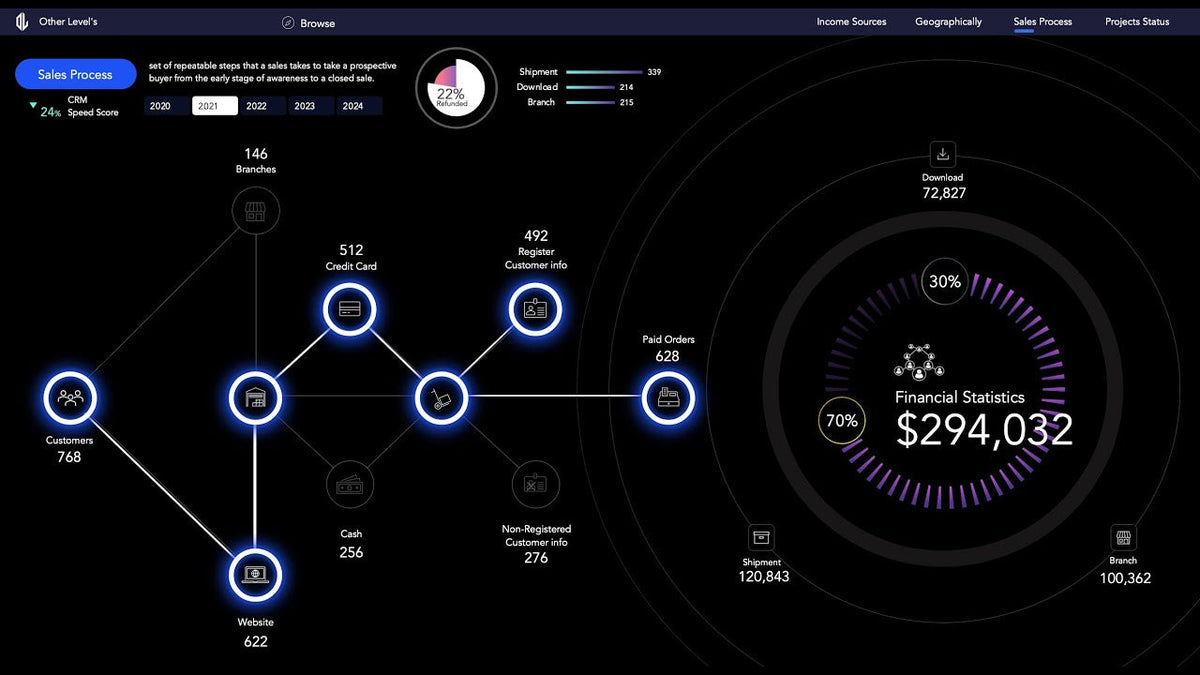
This sales process dashboard in Excel is one page of the Financial Statistics Dashboards System, a set of four connected dashboards covering income, profits by country, the sales process and project KPIs. It is aimed at professionals, analysts and business owners who want financial data turned into clear visuals. This video focuses on the sales side: a sales achievement donut, a stage-by-stage sales pipeline diagram, delivery type charts and a refund breakdown.
All four pages come together in the Financial Statistics Excel Dashboard for geographies and KPIs, which is useful if you want the finished system while you follow the tutorial.
The four dashboards in the financial statistics system
- Income Sources and Marketing Insight: a web chart of income sources, a doughnut chart of progress vs. financial goals, a monthly income line chart, average monthly income with an operating profit bar chart, and a comparison of marketing strategy impact. Controlled by a yearly slicer.
- Profits by Country: a dynamic map chart highlighting the most profitable region, tax breakdown by type, and a doughnut chart of profits vs. goal, all slicer-controlled.
- Sales Process Analysis: a sales pipeline diagram with stage-wise customer drop-offs, total sales vs. target, refunded orders, and sales by point of sale in bar and doughnut charts.
- Project Workflow and KPIs: project KPIs in a single layout, updated directly from the connected data table.
This tutorial builds the Sales Process Analysis page and ends by showing how to merge the dashboards into one file.
Building the sales achievement donut
The data behind this page includes orders, status, amounts and targets. The build goes like this:
- Create a PivotTable for total sales and targets.
- Calculate sales achievement % with a simple formula (sales divided by target).
- Build a donut chart from the achieved and remaining values.
- Overlay a pie and a scatter chart to mark the target visually, then set fixed axis min and max values so the layers line up.
- Link the data labels to dynamic cells so the percentages always match the data.
- Finish with decorative circles around the chart.
If you are new to combining chart types, Microsoft's guide to creating a chart from start to finish covers the chart basics these overlays build on.
The sales process dashboard diagram: show only what's used
This is the standout technique in the video. Instead of a standard funnel chart, the sales process is drawn stage by stage with shapes, icons and labels. Then formulas decide how each stage looks:
- Draw each stage of the process and add an icon and label to it.
- Use conditional highlighting to show the most used stages.
- Write an IF formula that returns a value when a stage is in use and nothing when it isn't.
- Link shapes to those results so they show or hide based on usage.
- Dim low-usage stages so the reader's eye goes straight to where customers actually move.
The result is a diagram that looks custom-drawn but reacts to the data, all with formulas and no VBA. Our guide to using the IF function for smarter decisions in Excel explains the formula behind the show and hide logic.
Delivery type and refund charts
- Total sales by delivery type uses the same donut technique as the achievement chart.
- A bar chart shows the sales count by delivery type.
- A custom pie chart shows the refund percentage.
The video also points out that the CRM notice area on the page is general information and is not pulled from the database, which is worth knowing if you adapt the file.
Why a custom sales pipeline beats a standard funnel
A standard funnel chart shows how many customers reach each stage, but every stage looks the same. The shape-based diagram adds meaning: the most used stages stand out, unused ones disappear, and weak stages are dimmed. That means a manager can see where customers drop off without reading a single number.
Because the diagram is driven by formulas, it changes with the data. When a new period is loaded, the highlighted and dimmed stages update on their own, so the page stays accurate without manual redesign.
Tips to adapt the sales page to your data
- Match stage names exactly. The IF formulas compare stage names, so the labels in your data and in the formulas must be identical.
- Set chart axis limits manually whenever you overlay charts. Automatic axes will drift apart when the data changes.
- Keep targets in the data table, not typed on the dashboard, so the achievement % stays correct for any period.
- Merge dashboards at the end. Build and test each page separately, then combine them into one file as the final step.
Practice with the real files: download the Financial Statistics dashboard dataset, and see the related dynamic Excel sales process diagram dataset. More files are in our free Excel practice datasets, and more finance layouts are in the financial dashboard collection.
Frequently asked questions
How do I create a sales process dashboard in Excel?
Summarize orders, amounts and targets with a PivotTable, then draw each sales stage with shapes and icons. Use IF formulas to decide which stages to show, highlight or dim, and add donut and bar charts for achievement, delivery type and refunds.
How does the sales pipeline diagram hide unused stages without VBA?
An IF formula checks whether each stage is used. Shapes are linked to those results, and low-usage stages are dimmed, so the diagram updates with the data.
Why overlay a pie and scatter chart on a donut?
The overlay lets you mark the target and style the progress ring in ways a single donut chart can't, while still being driven by the data.
Get the financial dashboard template
Get all four connected pages, including this sales process analysis, in the Financial Statistics Dashboards System for Excel. For other ready-made files, browse all our Excel dashboard templates.

Share:
How to Build an Excel Dashboard with AI (ChatGPT, Copilot & Claude)