

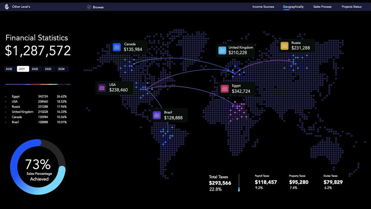
You can build a dynamic map chart in Excel that highlights your most profitable country without any map add-in. Tutorial 2 of the Financial Statistics Dashboards System builds the Profits by Country page: a map made from SVG shapes, a country income bar chart, an achievement progress circle and a tax breakdown. It is a good project for analysts and business owners with branches in several countries.
The finished page is part of the Financial Statistics Excel Dashboard for geographies and KPIs, which also includes the income, sales process and project KPI dashboards.
What the profits by country dashboard shows
- Profit rate per country from a PivotTable
- Total sales for all countries
- Country income in a gradient bar chart
- Achieved % in a progress circle chart
- A map with country names, sales amounts and dots marking profit levels, with the top country highlighted
- Tax breakdown by type and rate in a column chart
A yearly slicer controls the page, so every number and highlight updates when you change the year.
Part 1: PivotTable, text boxes and slicer
- Build a PivotTable to analyze profits by country and format it to show the profit rate for each one.
- Add text boxes linked to the pivot data, and format the source cells first so the text displays cleanly.
- Display total sales for all countries.
- Add a yearly slicer to control the dashboard.
Part 2: Country bars and the progress circle
The country income bar chart gets gradient colors on its bars. Later, these colors are matched to the country highlights on the map so the whole page reads as one system.
The progress circle for achieved % uses a neat trick: a scatter chart gives the donut rounded edges. The axis and markers are formatted for a clean layout, the chart is styled with a gradient and sized carefully, and the achieved percentage is displayed inside the circle.
Part 3: Building the dynamic map chart in Excel from shapes
This is the heart of the tutorial and the reason many people watch it. Instead of Excel's built-in map chart, the map is made from editable shapes:
- Prepare an SVG map to use as the base.
- Convert it to shapes using PowerPoint.
- Fragment and recolor the map so it fits the dashboard design.
- Show country names and total sales in text boxes placed on the map.
- Use the VLOOKUP function to pull each country's sales amount into the cells those text boxes are linked to.
If lookups are new to you, our guide on using VLOOKUP like a pro in Excel walks through the formula step by step.
Highlighting the top country with dots
- Add dot indicators for profit levels.
- Create an IF formula that identifies the top country.
- Style pink and blue dots to show visual priority.
- Group and position the dots over the map, then remove extra dots using the Selection Pane.
- Draw lines between the headquarters and each country branch.
Why a shape-based Excel map instead of the built-in map chart?
Excel does offer a filled map chart, but a shape-based map gives you design freedom it can't match. Every country is its own object, so you can recolor it, place labels exactly where you want, add dots of different sizes and colors, and draw connection lines from headquarters to branches.
Because the text boxes and dots are driven by VLOOKUP and IF formulas, the map still reacts to the data and the yearly slicer. You get a custom infographic look with the same interactivity as a standard chart.
Part 4: Tax analysis
The page ends with taxes: list the tax types and rates, calculate tax amounts using the percentages, and visualize the breakdown with a column chart.
Tips for your own map dashboard
- Use the Selection Pane constantly. A shape-based map has many objects; naming them makes linking and hiding far easier.
- Keep country names identical in the data, the lookup table and the map labels, or VLOOKUP will return errors.
- Group the map once it's finished so it moves as one object when you adjust the layout.
- Only map what you need. If you operate in a handful of countries, crop the map to that region so the dots and labels have room.
- Reuse the rounded progress circle on other dashboards. It works for any achieved-vs-target metric.
Build along with the same data: download the dynamic Excel map chart dataset for Tutorial 2, or start with the Financial Statistics dashboard system dataset. You'll find more files in our free Excel practice datasets, and more finance layouts in the financial dashboard collection.
Frequently asked questions
How do I make a dynamic map chart in Excel?
Convert an SVG map to shapes in PowerPoint, paste it into Excel, and place text boxes on each country. Link those text boxes to cells filled with VLOOKUP, and use IF formulas to decide which country gets the highlight.
Do I need Excel's built-in map chart for this?
No. The map is an SVG converted to shapes in PowerPoint, then linked to data with text boxes, VLOOKUP and IF formulas.
How is the most profitable country highlighted on the map?
An IF formula identifies the top country, and the dot styling (pink and blue dots) shows which country takes priority.
Can a slicer control the Excel map?
Yes. The yearly slicer filters the PivotTable, and because the map labels and dots are driven by formulas, they update with it.
Get the financial statistics dashboard
Want the finished map page plus the other three dashboards? Get the Financial Statistics Dashboards System with the profits by country map. For more ready-made files, browse all our Excel dashboard templates.

Share:
Sales Process Dashboard in Excel: Pipeline Diagram and Targets