✅ Instant Digital Delivery | 🔒 Secure Checkout | ⭐ Trusted by 1,000+ Professionals | 💬 24hr Support
Service Level Agreement Excel Dashboard – Customer Satisfaction Score
Pairs well with
Overview: Service Level Agreement Excel Dashboard – Customer Satisfaction Score
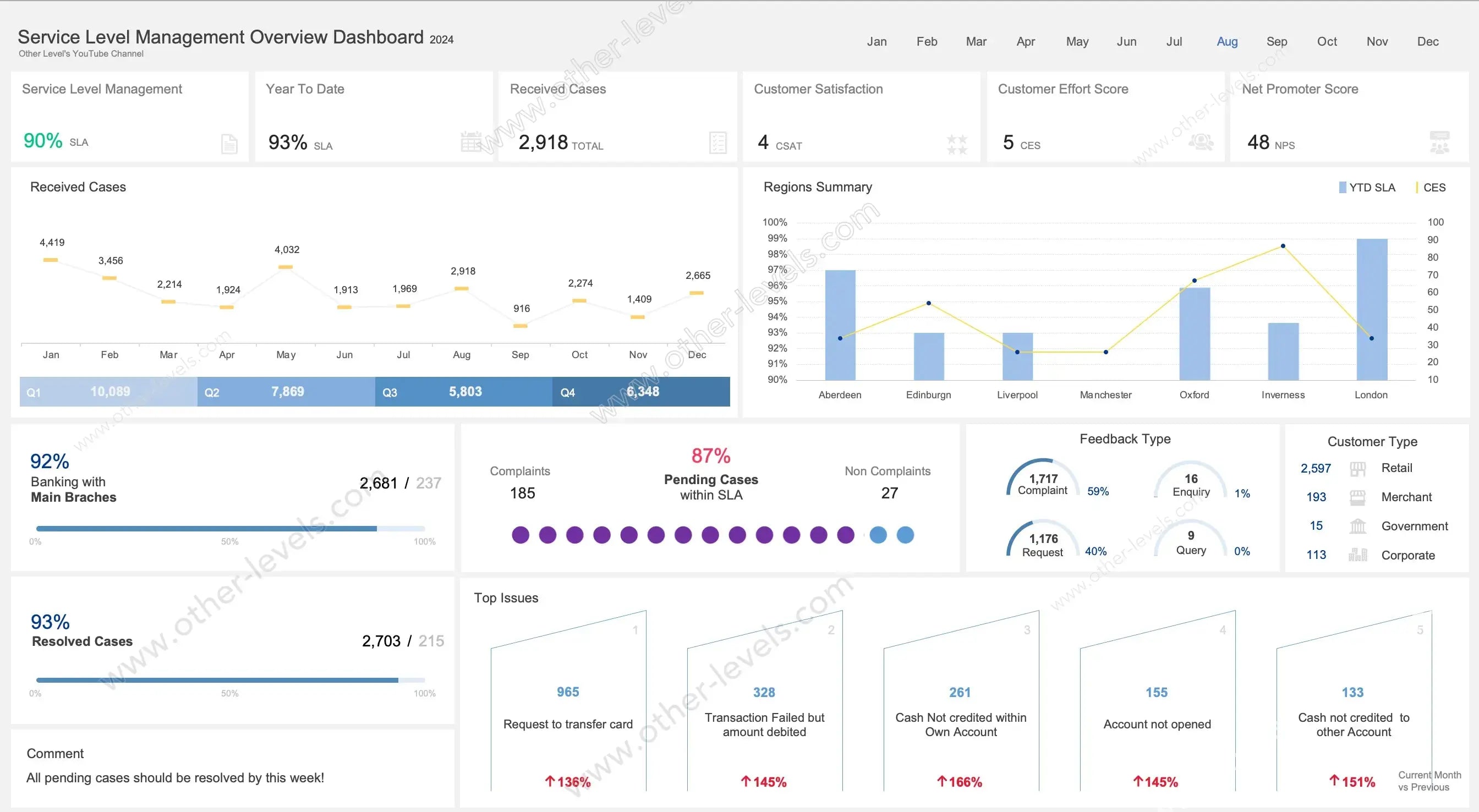
If you’ve ever tried keeping track of service delivery, you know it can get messy fast. This Service Level Agreement Excel Dashboard turns all that noise into something clear and actionable. Think of it like your go-to Spreadsheet for service level management. With one glance, you’ll see sla performance, workload flow, and the customer satisfaction score (CSAT). In practice, it’s not just a report—it’s a conversation starter for your team.
What this SLA Dashboard Really Shows
Here’s the thing: service data isn’t useful unless you can read it quickly. That’s why this sla dashboard lays out your service sla in a way that makes sense. It captures how cases come in, how fast they’re handled, and whether customers are walking away happy. You’ll notice every visual has a purpose—so managers can skip the spreadsheets with endless rows and go straight to decisions.
KPI Highlights
Core Service Metrics
- SLA %: Are you hitting the promise windows, yes or no?
- Year-to-Date SLA: A bigger picture—are you consistent across the year?
- Received Cases: A quick pulse on demand.
Customer Experience Metrics
- CSAT (customer satisfaction score): How people feel about their experience.
- CES: How much effort they had to put in to get help.
- NPS: Whether they’d recommend you to others.
Spotting Workload Patterns
A Line Chart maps cases across the months. Peaks and dips jump out fast. Then, quarters are stacked with Column Charts—Q1 through Q4—so you can see when the team is stretched thin. In practice, this is what helps with forecasting and avoiding the same mistakes twice.
Comparisons That Matter
By Region
A Clustered Column + Line Chart puts regions side by side. On one axis, you’ll see SLA compliance. Overlaid on top, effort scores. It tells you if one branch looks great on paper but is actually harder for customers to deal with.
By Customer Type
A KPI table shows who’s knocking at your door most often—retail, merchants, corporate, or even government. That’s where customer service management strategies get fine-tuned.
Resolution & Compliance
Horizontal bars tell the story of how many cases are resolved and how many are left hanging. Another chart highlights what’s still pending but technically within SLA. Here’s the catch—you don’t want too many hanging, because today’s “within SLA” can turn into tomorrow’s breach.
Feedback That Speaks Volumes
Complaints, requests, enquiries—they all land here in neat Donut Charts. You’ll notice when the balance tips, like if complaints suddenly climb. Alongside this, your CSAT, CES, and NPS cards explain the “why” behind the numbers. That’s where sla metrics meet real voices.
Digging Into Top Issues
The dashboard doesn’t just stop at numbers. It pulls out the top five issues, shows their growth compared to last month, and adds trend arrows so you can’t miss them. It’s a simple but powerful way to spot patterns before they spiral.
Manager Notes
One more thing—it’s not just static data. There’s a comment space so managers can write notes, priorities, or next steps. It keeps the dashboard alive and practical instead of just being a monthly slideshow.
Interactivity
You can slice and dice the data with filters. Want to check just August? Or maybe only retail cases in one region? Done. Every chart updates in sync. That’s how you turn a Spreadsheet into a living control panel.
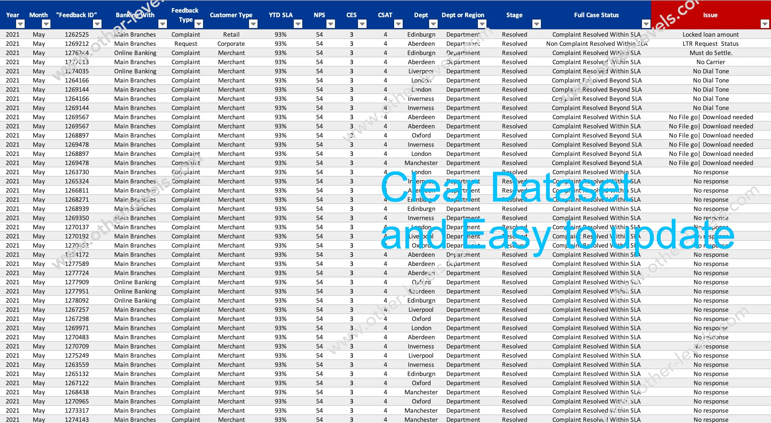
Under the Hood
The dataset is straightforward: IDs, open and close dates, SLA targets, case types, and customer responses like CSAT or CES. It’s all Excel-native—no plug-ins or macros. Think of it as clean, smart, and flexible. It’s not an excel format for expense reports or a will template. It’s built to be a sla dashboard through and through.
SLA in Context
In case you’re new: sla meaning is simply the agreed time window. sla meaning business is the way companies commit to meet it. And sla in contract is where those promises get written down—so this dashboard is your way of showing proof that you’ve met them.
Who It’s For
This fits right into weekly stand-ups, executive check-ins, and client reporting. Contact centers, back-office teams, or any managed services provider can plug it in and go. It’s all about reducing escalations and boosting financial performance by staying ahead of the data instead of behind it.
Charts You’ll Get
- KPI Cards for SLA, YTD SLA, Received, CSAT, CES, NPS
- Line Chart for monthly workload
- Column Chart for quarterly totals
- Clustered Column + Line Combo for region comparison
- Horizontal Progress Bars for branches and resolved cases
- Dot Indicator for pending cases
- Donut / Semi-Gauge for feedback mix
- Ranked Columns with Trend Arrows for top issues
Compatibility
Everything runs in Excel—no add-ons, no complicated setup. Just open it, connect your data, and you’re ready. And if you’re exploring other dashboards, you might also like the Stock Market Dashboard with Dynamic Line Chart Indicator or the Supply Chain and Freight Analytics Excel Dashboard. Both pair perfectly with this SLA view for a bigger performance picture.
Specifications
Get all essential details in one place. From features and package contents to software compatibility and skill level required, this section gives you a clear overview so you know exactly what to expect before download.
Template Features
Package Details
Software Compatibility
Skill Level Required
Beginner
FAQs
Please read our FAQs page to find out more.
Are the templates fully customizable?
Yes, all our templates are fully customizable. You can adjust the layout, data, and design elements to fit your specific needs. Our templates are designed to be flexible, allowing you to easily tailor them to your preferences.
Can I order a product in any language?
Yes, we provide products in any language. Simply select the "Dashboard language change" Service and once your order is placed, you will receive it within 48 hours.
What happens if I choose the wrong monitor screen size for my dashboard?
If you choose the wrong screen size, the dashboard may not display correctly on your monitor. Elements could appear too large, too small, or misaligned, affecting the readability and usability of the dashboard. We recommend selecting the appropriate screen size to ensure optimal viewing and performance.
Do I need specific skills to use the advanced Excel dashboard templates?
Our advanced Excel dashboards are easy to use, the only thing you need to know is how to work with PivotTables. With basic knowledge of PivotTables, you'll be able to customize and fully utilize these templates effortlessly. "Please check the skill level required"
All dashboards are 100% editable Excel files. Learn how to use them through our video tutorials, included datasets, and lifetime access program.