✅ Instant Digital Delivery | 🔒 Secure Checkout | ⭐ Trusted by 1,000+ Professionals | 💬 24hr Support
Financial Performance PowerPoint Dashboard - KPI Metrics
Pairs well with
Financial Performance PowerPoint Dashboard Template Overview
Here’s the thing—sometimes you don’t need walls of spreadsheets. You need a PowerPoint Dashboard that instantly shows financial performance in a clean, modern way. This template gives you exactly that. It’s presentation-ready, styled as a dark purple powerpoint template, and fits right in with other dark powerpoint templates or modern powerpoint templates. If you’re looking for complementary tools, check out the Dynamic & Interactive Dashboard - Finance Status & Projects Milestone or the Excel KPIs Scorecards Dashboard & Data Analysis Tool . They work beautifully alongside this template for a full reporting setup.
Quick Overview
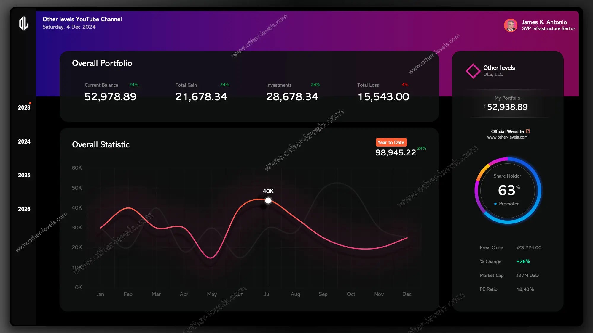
You’ll notice the dashboard is divided into clear sections. Each one focuses on the story behind the numbers, not just the numbers themselves. You’ve got:
- KPI cards for key performance indicators metrics
- A trend line graph for performance over time
- A donut chart for shareholders breakdown
- Clean blocks for company info
Header & Identity
Title and Date
The top bar keeps things simple. A clear title, today’s date, and you’re ready for the boardroom. No fiddling with updates before each meeting.
User Profile
Right next to it, you’ll see the profile card. It adds a face and role, which makes the deck feel personal and owned. A small detail, but it changes how people connect with the slide.
Company Panel
On the side, there’s a section for company info. Think of it as your brand stamp—portfolio context, website link, or even a tagline if you like.
Overall Portfolio — KPI Cards
Now let’s talk about the heart of it. The KPI row gives you the big picture fast. These are your key performance indicators templates, and they’re flexible enough to cover anything from finance to e commerce key performance indicators.
What’s Tracked
- Current Balance
- Total Gain
- Investments
- Total loss
Each card has visual cues—green when things are up, red when things drop. No overthinking. Just instant clarity.
Overall Statistics — Spotting the Story
In practice, you don’t just care about one number. You want to see movement. That’s where the trend line comes in. It tells you the story across months, with highs, lows, and that one big spike you’ll probably point out in the meeting.
There’s even a YTD callout off to the side, so you always know how the year’s stacking up.
Chart type used: trend line graph.
Shareholder & Market View
Shareholder Distribution
Here’s a part people always look at—the shareholders split. It’s shown with a donut chart. Clean, round, and easy to read. Promoters, partners, whoever—you’ll know the balance right away.
Market Quick Stats
Just below, you’ll see mini-cards with things like % change, market cap, and PE ratio. They’re the “headline facts” that give context without drowning you in details.
Navigation & Filters
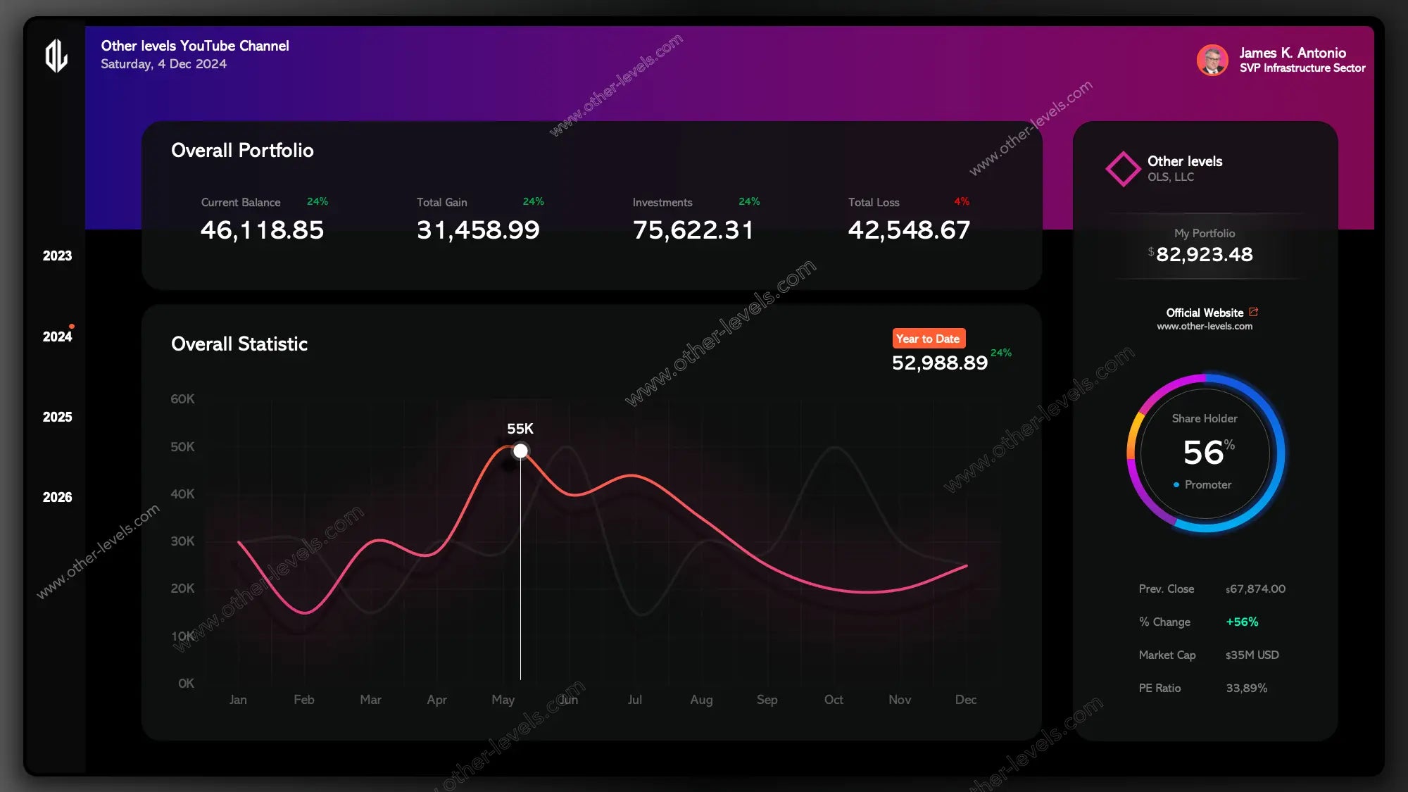
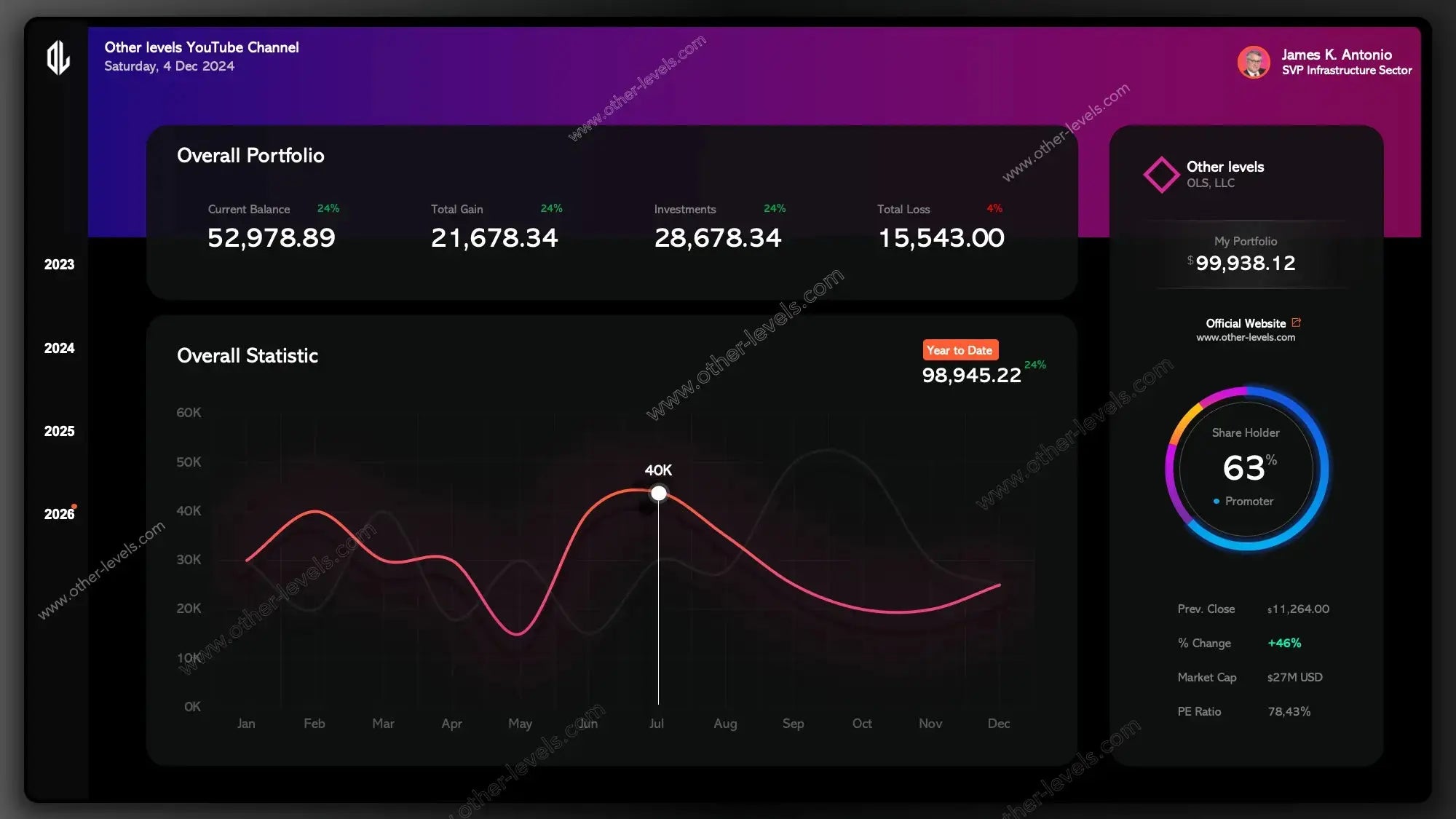
You’ll notice the left-hand rail. That’s your time selector. Flip through years with one click, and everything updates instantly. It feels smooth, like browsing slides, but it’s actually Excel slicers under the hood.
Design & Presentation
The dashboard leans into dark mode. That means softer contrast, neon highlights, and better focus on charts. It’s especially handy in boardrooms or at the Center for Visual and Performing Arts where lighting might vary—you still get crisp visuals on big screens.
Since it’s a PowerPoint Dashboard, you can duplicate slides, swap out data, and build a whole series of decks without touching the core design.
Chart Types Used
- KPI Cards / Scorecards for key performance indicators metrics
- Trend line graph for ongoing performance
- Donut chart for shareholders overview
Behind the Scenes
Data Structure
It all runs off structured Excel tables. One for KPIs, one for the trend line, one for shareholders. Nothing complicated. Just clean tables you can refresh or replace.
Filters
Year slicer, category options, and easy hooks for expanding if you need more layers later.
When to Use It
Think investor updates, executive briefings, or quarterly reviews. Anywhere you need to show financial performance in a story-driven way. If you run an online store, plug in your e commerce key performance indicators. If you’re in corporate finance, lean on the balance and gains. The flexibility’s built in.
FAQ
What is a trend line?
Good question. A trend line is simply a line that shows direction. Up, down, or flat—it gives you the sense of momentum without needing every detail. This template answers the “what is a trend line” question by showing it in action.
What’s Included
- PowerPoint slide with all dashboard visuals
- Excel workbook with tables, named ranges, and slicers
- Quick start notes so you can plug in your own numbers
Step-by-Step Video Tutorial
Specifications
Get all essential details in one place. From features and package contents to software compatibility and skill level required, this section gives you a clear overview so you know exactly what to expect before download.
Template Features
Package Details
Software Compatibility
Skill Level Required
Beginner
FAQs
Please read our FAQs page to find out more.
Are the templates fully customizable?
Yes, all our templates are fully customizable. You can adjust the layout, data, and design elements to fit your specific needs. Our templates are designed to be flexible, allowing you to easily tailor them to your preferences.
Can I order a product in any language?
Yes, we provide products in any language. Simply select the "Dashboard language change" Service and once your order is placed, you will receive it within 48 hours.
What happens if I choose the wrong monitor screen size for my dashboard?
If you choose the wrong screen size, the dashboard may not display correctly on your monitor. Elements could appear too large, too small, or misaligned, affecting the readability and usability of the dashboard. We recommend selecting the appropriate screen size to ensure optimal viewing and performance.
Do I need specific skills to use the advanced Excel dashboard templates?
Our advanced Excel dashboards are easy to use, the only thing you need to know is how to work with PivotTables. With basic knowledge of PivotTables, you'll be able to customize and fully utilize these templates effortlessly. "Please check the skill level required"
All dashboards are 100% editable Excel files. Learn how to use them through our video tutorials, included datasets, and lifetime access program.