Conditional Formatting in Excel: Automatically Highlight Key Data
Want your spreadsheet to highlight important data automatically? That’s exactly what Conditional Formatting in Microsoft Excel does. With just a few clicks, you can color, icon-mark, or style cells based on conditions—helping you spot overdue tasks, duplicates, or performance trends instantly.
📘 What Is Conditional Formatting in Excel?
Conditional Formatting changes how your data looks depending on set conditions. It automatically applies colors, bold text, or icons to highlight values that meet specific criteria—ideal for patterns, outliers, or performance indicators. It’s a visual shortcut for better analysis without manual editing.
🧩 Step-by-Step: How to Apply Conditional Formatting
- Select your data range (e.g., A1:A10)
- Go to the Home tab → click Conditional Formatting
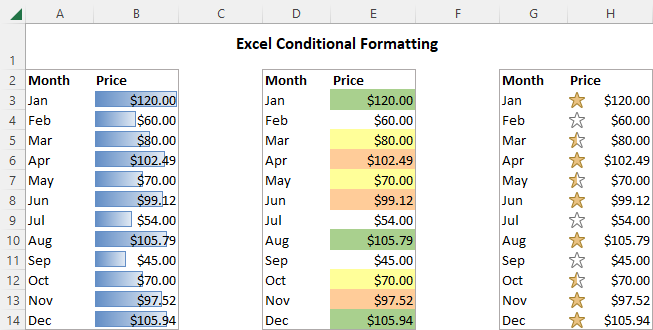
- Choose one of the following rule types:
- Highlight Cell Rules – greater than, less than, equal to
- Top/Bottom Rules – top 10%, bottom 5 items
- Data Bars – color bars within cells
- Color Scales – gradient colors for high/low values
- Icon Sets – arrows, traffic lights, check marks
- Set your condition and click OK
Your data now visually updates whenever values change — no manual editing needed.
🌟 Best Uses for Conditional Formatting
- Highlight overdue dates with rule:
=A2<TODAY() - Emphasize sales below target goals
- Show grade or performance levels with color scales
- Spot duplicates using “Highlight Cell Rules → Duplicate Values”
- Use icon sets for progress or risk indicators
⚙️ Advanced Conditional Formatting with Formulas
Create dynamic rules using formulas. For example:
=AND(A2>100, B2<50)
This highlights rows where A2 is above 100 and B2 is below 50. You can even highlight entire rows based on a value, e.g.:
=$A2="Overdue"
💡 Expert Tips
- Use Manage Rules to edit or clear formatting
- Combine with Data Validation to flag wrong entries
- Use Format Painter to copy rules efficiently
- Keep your color palette consistent with your Excel dashboard templates
📊 Real-World Examples
- Finance: Highlight over-budget expenses
- Sales: Color-code regions by target performance
- Project Management: Flag overdue tasks automatically
- Education: Visualize grade levels with scales
With a few clicks, you can transform static spreadsheets into colorful, intelligent dashboards that communicate insights clearly. It’s one of the simplest and most impactful Excel dashboard tools for professionals.
🎓 Learn More with Other Levels
Enhance your Excel productivity and design dashboards that stand out:
- 🌐 Visit our Other Levels Website
- 📺 Watch tutorials on our Other Levels YouTube Channel — from beginner to advanced Excel tips
📚 Related Excel Tutorials
- Create Heatmaps for Data Visualization in Excel
- Remove Duplicate Data in Microsoft Excel
- Easily Analyze Data with Excel’s Data Analysis Toolpak
Share:
Excel Freeze Panes – Lock Headers on Large Spreadsheets
Clean Messy Data in Excel Instantly with the TRIM Function