Excel Dashboard Heatmaps – Conditional Formatting Guide
Heatmaps are the fastest way to turn tables into insight. When you’re building an Excel Dashboard, a color-scale heatmap instantly surfaces highs, lows, and trends without extra charts, add-ins, or code.
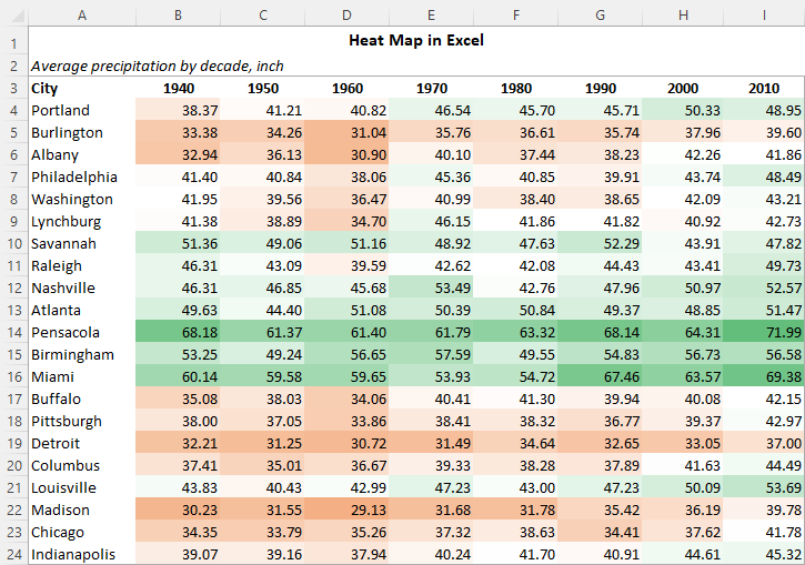
What is a heatmap?
A heatmap colors each cell according to value intensity, helping you spot patterns at a glance. Use it to highlight best/worst performers, compare across months, or scan for outliers without reading every number.
Create a heatmap with Conditional Formatting
- Select your data range (headers optional).
- Go to Home → Conditional Formatting → Color Scales.
- Pick a 2-color or 3-color scale (e.g., green-yellow-red).
- Optional: Manage Rules → Edit Rule to set custom min/mid/max.
Make it decision-ready
- Use a cool-to-warm palette for intuitive reading.
- Remove gridlines and align numbers for a clean look.
- Add data bars or icons to layer context when needed.
- Apply the rule to a PivotTable to summarize segments or periods.
Advanced customization
- Lock thresholds (percentile vs number) to keep scales consistent across reports.
- Combine with slicers or filters for interactive exploration.
- Create category-specific rules to compare peers fairly.
Practical examples
- Sales performance: spot hot regions and weak SKUs.
- Classroom grades: identify high/low scoring topics quickly.
- Marketing: compare engagement rates by channel and week.
- Inventory: flag fast- and slow-moving items at a glance.
Explore templates and next steps
Want ready-made visuals? Browse curated Dashboard Templates, explore our Excel Dashboard collection, or scale to richer analytics with Power BI Dashboard solutions.
Share:
Clean Excel Data Fast by Finding and Removing Duplicates
Excel Dashboard Tip – Insert Date and Time Instantly