Working with Bulky Data Sets Becomes Easy with Pivot Tables
When you need to quickly analyze, summarize, and explore your data, nothing beats the power of Microsoft Excel’s Pivot Table. With just a few clicks, you can create interactive reports, highlight trends, and uncover insights — all without writing a single formula.
📊 What Is a Pivot Table?
A Pivot Table is an interactive summary tool that helps you reorganize and analyze selected data from your worksheet. It allows you to:
- Group and filter large datasets
- Sum, average, or count values instantly
- Create dynamic cross-tab reports
- Identify patterns and insights at a glance
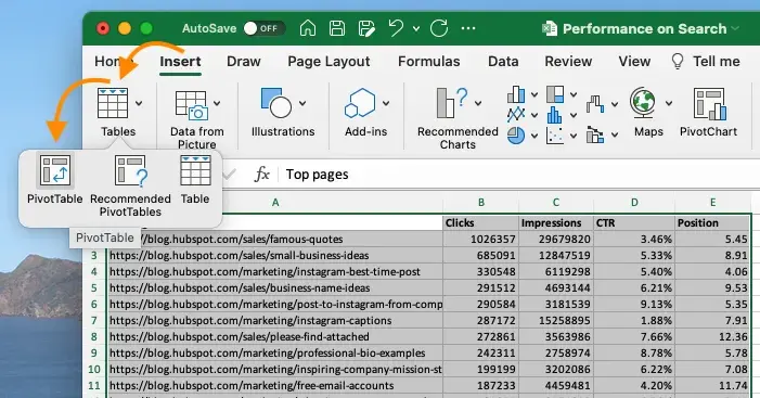
⚙️ How to Create a Pivot Table (Step-by-Step)
- Select your dataset (make sure it includes headers)
- Go to Insert → PivotTable
- Choose to place the Pivot Table in a new or existing worksheet
- Use the PivotTable Fields pane to drag and drop:
- Rows: Product Names
- Columns: Regions
- Values: Total Sales
- Filters: Year or Quarter
Your Pivot Table will automatically summarize and display your data in seconds.
💼 Common Reasons to Use Pivot Tables
- Summarize sales by product, region, or team
- Count customers by category or status
- Analyze expenses by department or cost type
- Drill down into trends by year, month, or week
💡 Quick Pivot Table Tips
- Right-click the Pivot Table to refresh data after updates
- Under Value Field Settings, change summary type (SUM, COUNT, AVERAGE, etc.)
- Format your source range as a Table to make your Pivot Table dynamic
📈 Add Pivot Charts for Better Visualization
- Click anywhere inside your Pivot Table
- Go to Insert → PivotChart
- Select a chart type — Bar, Line, or Pie
- Customize titles, legends, and formatting for a professional look
Once you master Pivot Tables, analyzing large datasets becomes effortless — turning raw numbers into clear, actionable insights in minutes.
🎓 Learn More with Other Levels
Take your Excel skills further with step-by-step guides and professional dashboards:
- 🌐 Visit our Other Levels Website
- 📺 Watch tutorials on the Other Levels YouTube Channel
📚 Related Excel Tutorials
- Experience the Power of CONCAT Function in Microsoft Excel
- Microsoft Excel Keyboard Shortcuts to Boost Productivity
- Use VLOOKUP Function Like a Pro in Microsoft Excel
Share:
Use VLOOKUP Function Like a Pro in Microsoft Excel
Excel IF Function – Automate Smart Decisions in Your Spreadsheets