✅ Instant Digital Delivery | 🔒 Secure Checkout | ⭐ Trusted by 1,000+ Professionals | 💬 24hr Support
Service Level Agreement Excel Dashboard – Managed Services
Pairs well with
Service Level Agreement Excel Dashboard – Managed Services
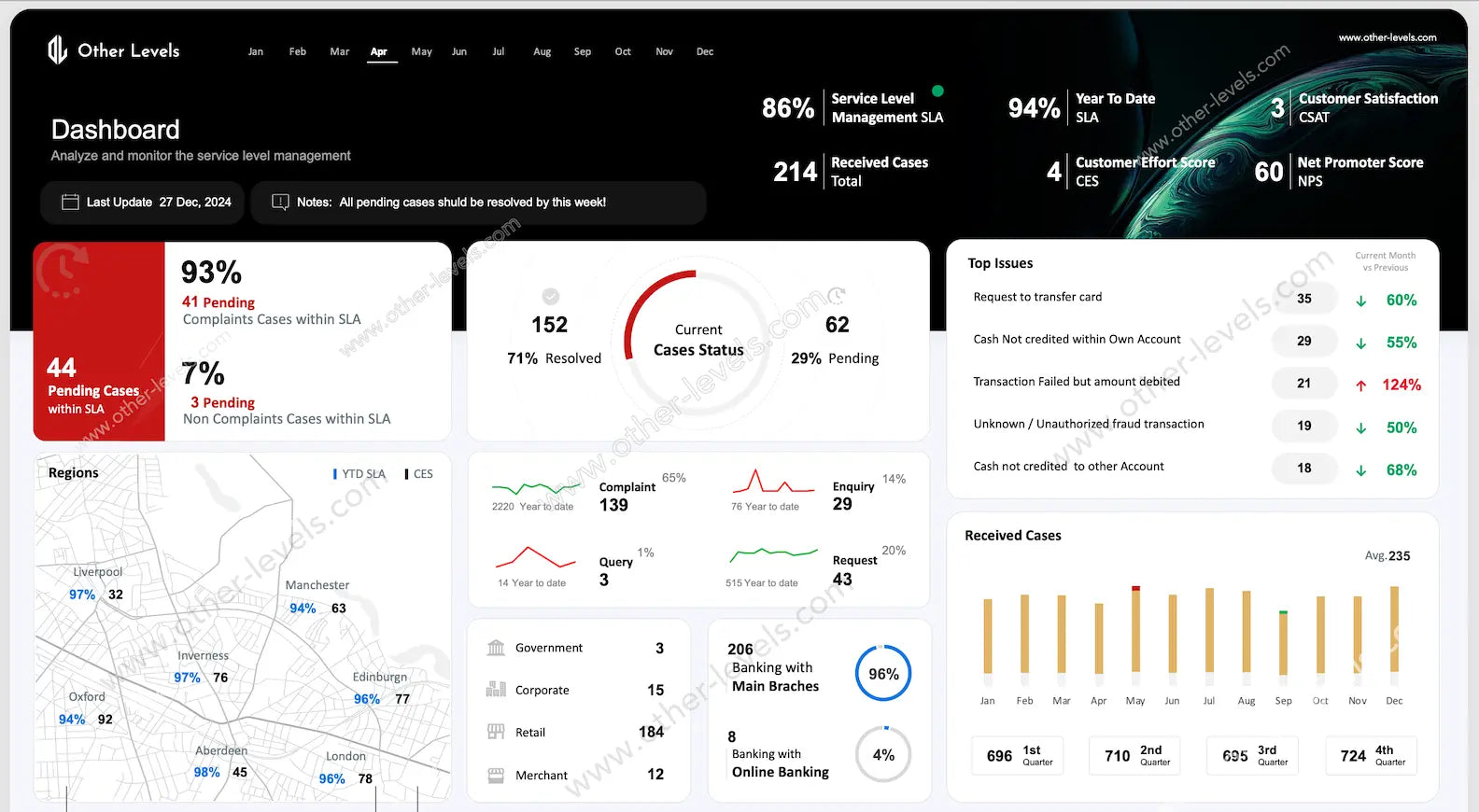
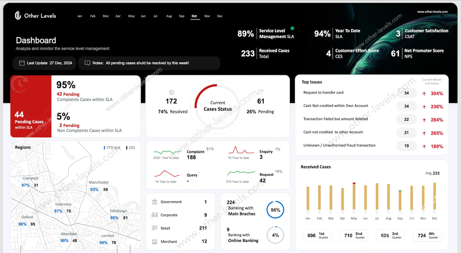
Here’s the thing—keeping track of service level management isn’t always easy. That’s why we built this Service Level Agreement Excel Dashboard. It gives you a clear, real-world view of how your service sla is performing, all in one place. Think of it as your control panel for managed services: quick to read, easy to act on, and always ready to refresh with new data.
What This Dashboard Covers
You’ll notice the dashboard doesn’t just show numbers. It tells a story of your sla performance. You can instantly see how many cases are resolved, which ones are pending, and where the pressure points are. At the same time, it captures customer satisfaction score (csat), effort levels, and advocacy metrics—so you get the full picture, not just half of it.
- Snapshot of sla metrics like compliance percentage and case status.
- Breakdown of resolved vs. pending cases with easy visuals.
- Customer experience indicators—because good service is more than closing tickets.
- Regional and branch performance to help you prioritize resources.
Charts & Visuals That Make Sense
Instead of reading raw data, you’ll interact with visuals that actually make sense:
- KPI Cards for SLA %, pending share, and csat.
- A Donut / Gauge Chart that shows current case status at a glance.
- Line Charts for trends in complaints, enquiries, and requests.
- A Map Chart that highlights regional SLA performance.
- Column Charts for monthly and quarterly received cases.
- A Top Issues Table with arrows showing what’s getting better and what needs attention.
Interactive Features
In practice, you won’t just look at the data—you’ll play with it. Filters and slicers let you switch between regions, months, or case types. Conditional formatting highlights cases slipping out of SLA. And the notes panel? That’s where you set reminders like, “all pending cases should be resolved this week.” Simple, but effective.
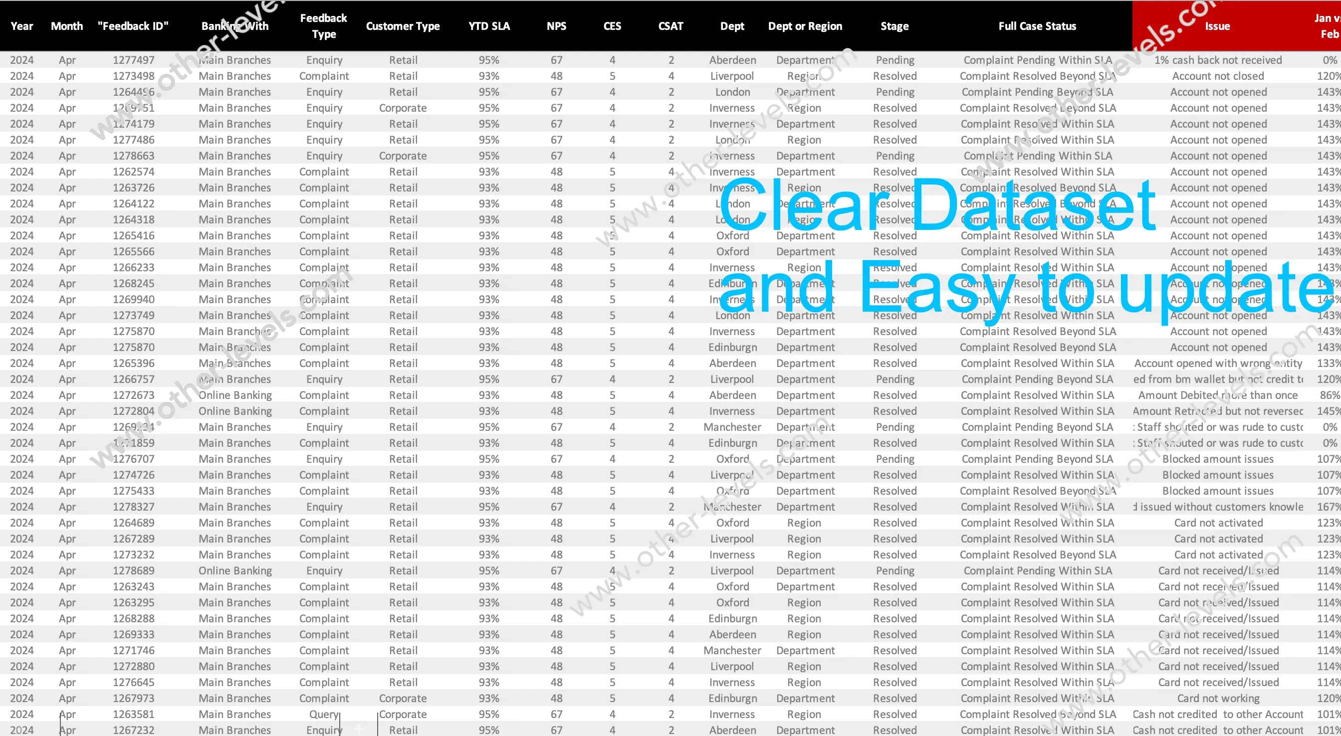
Spreadsheet Workflow
The structure is straightforward. Load your data into the source table, refresh, and everything updates. It’s pivot-ready and clean. If needed, you can even link it with excel format for expense reports or track how delays impact financial performance. This makes it a practical tool that goes beyond tracking—it helps you explain what those numbers mean in business terms.
Understanding SLA
Let’s pause for a second. If you’re still wondering about sla meaning—it’s the promise you make to your customer. Sla meaning business is about how those promises shape trust. And when it comes to sla in contract, this dashboard helps you keep every commitment visible and measurable.
Who Should Use It
If you’re managing customer service management teams, running managed services, or reporting on sla metrics, this template is built for you. It makes reporting less about raw data and more about insights you can act on.
How to Get Started
- Paste your case data—dates, regions, case types, and status—into the table.
- Refresh the dashboard. Done. All visuals update instantly.
- Use slicers to drill into months, branches, or specific case types.
- Check the Top Issues list to know what really matters right now.
- Write quick notes to stay on track with your service level management goals.
Related Dashboards You’ll Like
Want to go deeper? Pair this with the Services Requests Management Power BI Dashboard Template to manage requests end-to-end. Or check out the Service Level Management Overview Excel Dashboard SLA for a broader SLA view. Together, they give you everything you need to track, analyze, and improve.
Final Note
This isn’t just another sla dashboard. It’s a tool that makes your service sla commitments real. It surfaces the gaps before they become problems. And it helps you run managed services with confidence, clarity, and accountability.
Watch the Tutorial
Service Level Agreement Excel Dashboard tutorial on YouTube
Watch the full tutorial on our Other Levels YouTube Channel
Specifications
Get all essential details in one place. From features and package contents to software compatibility and skill level required, this section gives you a clear overview so you know exactly what to expect before download.
Template Features
Package Details
Software Compatibility
Skill Level Required
Beginner
FAQs
Please read our FAQs page to find out more.
Are the templates fully customizable?
Yes, all our templates are fully customizable. You can adjust the layout, data, and design elements to fit your specific needs. Our templates are designed to be flexible, allowing you to easily tailor them to your preferences.
Can I order a product in any language?
Yes, we provide products in any language. Simply select the "Dashboard language change" Service and once your order is placed, you will receive it within 48 hours.
What happens if I choose the wrong monitor screen size for my dashboard?
If you choose the wrong screen size, the dashboard may not display correctly on your monitor. Elements could appear too large, too small, or misaligned, affecting the readability and usability of the dashboard. We recommend selecting the appropriate screen size to ensure optimal viewing and performance.
Do I need specific skills to use the advanced Excel dashboard templates?
Our advanced Excel dashboards are easy to use, the only thing you need to know is how to work with PivotTables. With basic knowledge of PivotTables, you'll be able to customize and fully utilize these templates effortlessly. "Please check the skill level required"
All dashboards are 100% editable Excel files. Learn how to use them through our video tutorials, included datasets, and lifetime access program.