✅ Instant Digital Delivery | 🔒 Secure Checkout | ⭐ Trusted by 1,000+ Professionals | 💬 24hr Support
Finance Forecasting Excel Dashboard – P and L Statement
Pairs well with
Overview: Finance Forecasting Excel Dashboard – P and L statement
Meet your new control room. A modern, dark-mode Finance Forecasting Excel Dashboard that helps you see the numbers that matter most. Click, filter, decide—it’s fast, structured, and built for financial clarity. This dashboard is designed to give executives, analysts, and finance teams an instant view of profit and loss, contracts, invoice amount, and expenses while keeping the structured dataset clean and reliable.
What you’ll get
- Quick comparisons of plan vs. reality.
- Clear breakdowns of spending—where it comes from and why.
- Tracking for contracts, invoices, and cash movement.
- Trends that reveal the full profit and loss story.
- A tidy dataset designed for fast analysis and pivot-table use.
Filters & controls
Choose a year, sector, or location with slicers. Each filter instantly updates charts, KPI cards, and GAP analysis. A small timestamp shows the last refresh—perfect for meetings and real-time check-ins.
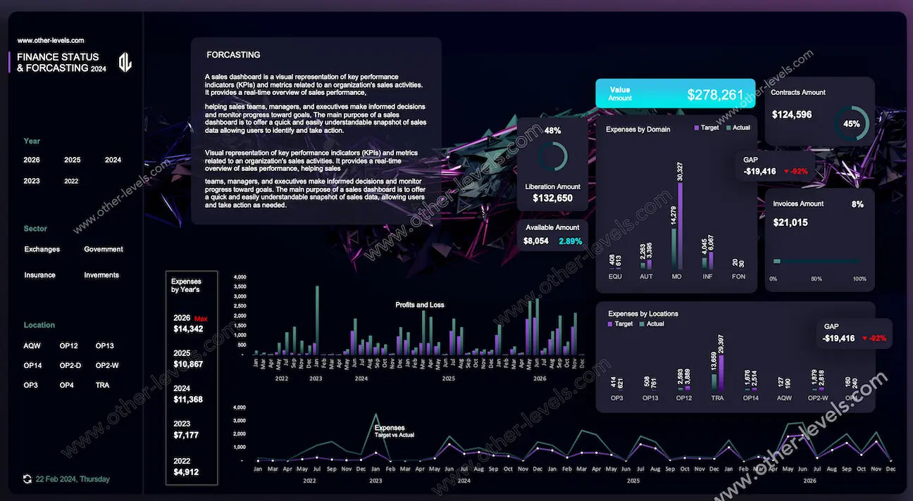
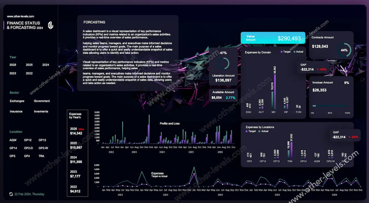
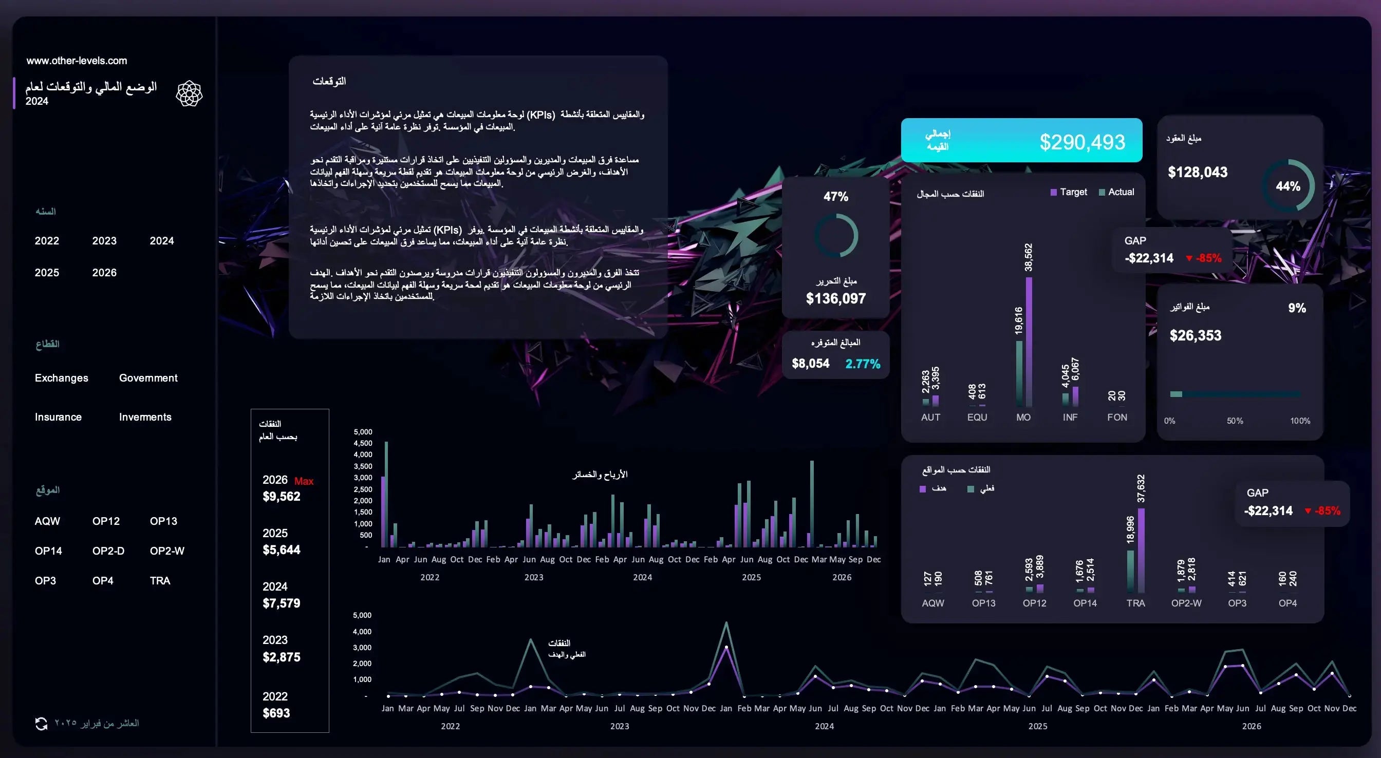
KPI Layer
- KPI card for Value Amount: the pulse of the portfolio.
- Doughnut gauge for Contracts Amount: progress toward plan.
- Horizontal stacked bar chart for Invoices Amount: track billing progress.
- KPI card for GAP (variance): instantly shows variance vs target.
- Mini widgets for liberal amount and Available Amount: quick signals with zero clutter.
Breakdowns & Analysis
Clustered column charts compare Target vs Actual for domains, sectors, and locations, while GAP badges flag variance. A compact yearly snapshot provides context before drilling into monthly profit and loss. Expenses Target vs Actual are tracked with a dual-line chart, showing overspending or savings at a glance.
Time-Series & Trends
Monthly profit and loss columns highlight seasonality, spikes, and dips. Expenses dual-line trends show margin protection or overspending moments. Together, these charts turn history into foresight.
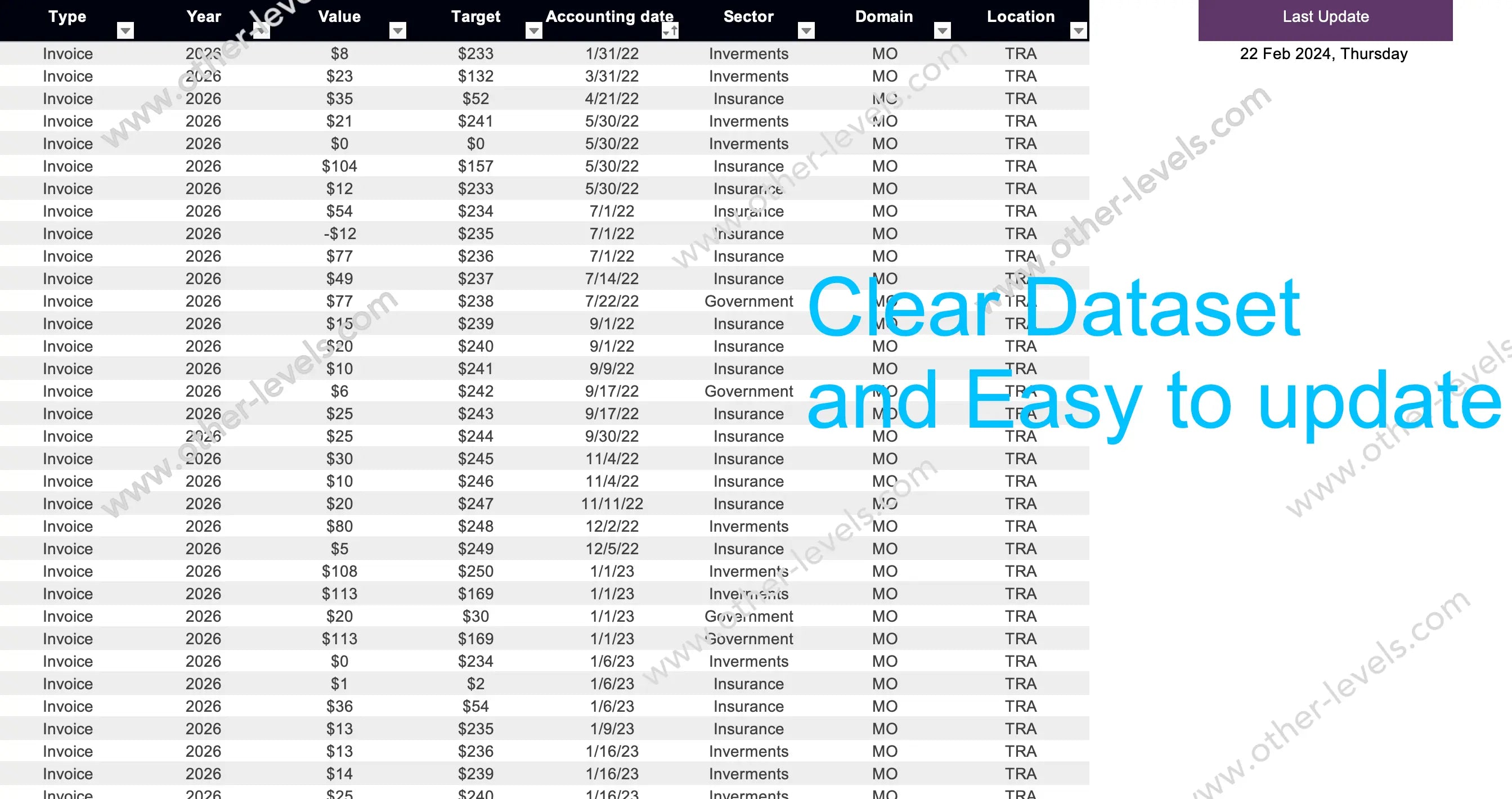
Data Model & Calculations
Everything runs in a Spreadsheet that’s easy to edit and audit. Data includes transactions by sector, domain, location, and type. Totals roll up automatically, GAP = Actual – Target, and contributions reveal who moves the needle. Excel forecast and forecasting in excel workflows are supported, with tables ready in excel format for expense reports.
UX & Design
Consistent legends, calm colors, and a clean dark mode keep insights sharp in presentations. Every chart has a role—this is about useful charts, not clutter.
How teams use it
- Executives: scan KPIs, check GAP, drill into domains.
- Ops & Cost Control: monitor dual-line spend vs target.
- Billing & Cash Flow: align contracts with invoice amount progress.
From Insight to Action
Identify variance, prioritize fixes, reallocate budgets. Insights flow directly into a progress action fund that moves results instead of just reporting them.
Chart Inventory
- KPI cards for Value, GAP, and Available Amount
- Doughnut gauges for Contracts and Liberation Amount
- 100% stacked bar chart for Invoices
- Clustered columns for Expenses by Domain, Location, and P&L
- Compact yearly expenses snapshot
- Dual line chart for Target vs Actual
- Slicers for Year, Sector, Location
Related Finance Dashboards
- Personal Finance Excel Dashboard - Excel Mobile Version
- Personal Finance Tracker Dashboard – Advanced Excel Tool
Video Tutorial — Build This Finance Forecasting Excel Dashboard
Specifications
Get all essential details in one place. From features and package contents to software compatibility and skill level required, this section gives you a clear overview so you know exactly what to expect before download.
Template Features
Package Details
Software Compatibility
Skill Level Required
Intermediate
FAQs
Please read our FAQs page to find out more.
Are the templates fully customizable?
Yes, all our templates are fully customizable. You can adjust the layout, data, and design elements to fit your specific needs. Our templates are designed to be flexible, allowing you to easily tailor them to your preferences.
Can I order a product in any language?
Yes, we provide products in any language. Simply select the "Dashboard language change" Service and once your order is placed, you will receive it within 48 hours.
What happens if I choose the wrong monitor screen size for my dashboard?
If you choose the wrong screen size, the dashboard may not display correctly on your monitor. Elements could appear too large, too small, or misaligned, affecting the readability and usability of the dashboard. We recommend selecting the appropriate screen size to ensure optimal viewing and performance.
Do I need specific skills to use the advanced Excel dashboard templates?
Our advanced Excel dashboards are easy to use, the only thing you need to know is how to work with PivotTables. With basic knowledge of PivotTables, you'll be able to customize and fully utilize these templates effortlessly. "Please check the skill level required"
All dashboards are 100% editable Excel files. Learn how to use them through our video tutorials, included datasets, and lifetime access program.