✅ Instant Digital Delivery | 🔒 Secure Checkout | ⭐ Trusted by 1,000+ Professionals | 💬 24hr Support
KPI PowerPoint Dashboard - Executive Summary Template
Pairs well with
KPI PowerPoint Dashboard Executive Summary Template and Project Performance
This KPI PowerPoint Dashboard is a modern executive reporting system designed to visualize strategic progress, track project milestones, and monitor team actions within one streamlined view. Inspired by real-world corporate dashboards, it blends storytelling with analytics to give leaders fast clarity during review meetings and performance discussions. Every section—from KPIs to timelines—is engineered for instant comprehension and presentation impact.
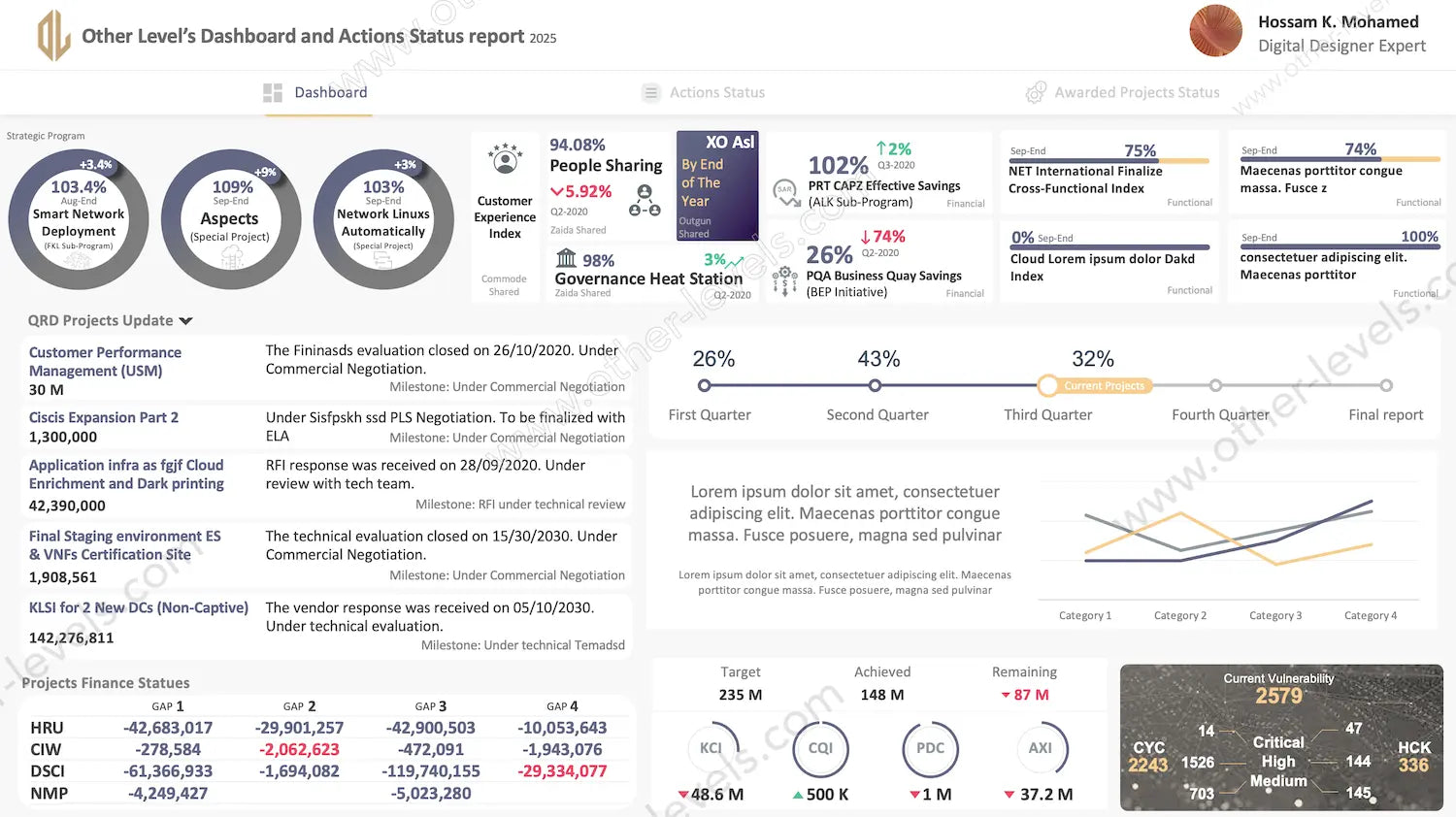
Strategic Dashboard Overview
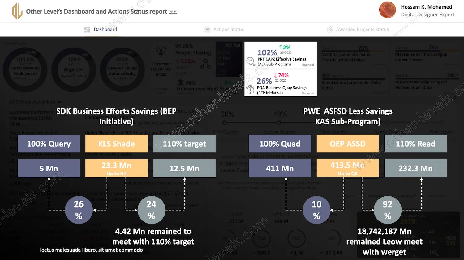
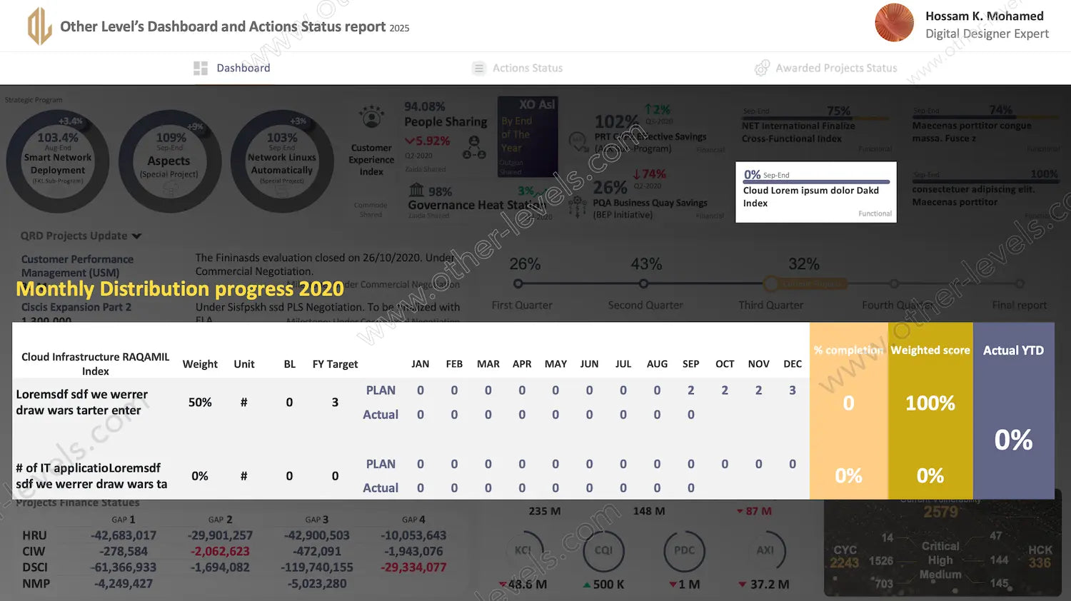
The main dashboard displays key programs and project outcomes through radial gauges, KPI cards, and progress timelines. Circular gauges highlight strategic performance, while KPI cards visualize trends such as cost savings, governance, and customer experience. A multi-line chart tracks category progress over time, giving a dynamic pulse of overall performance health without overwhelming the viewer.
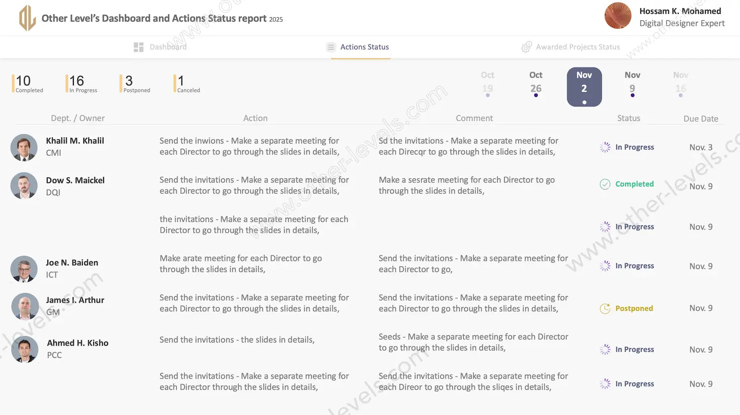
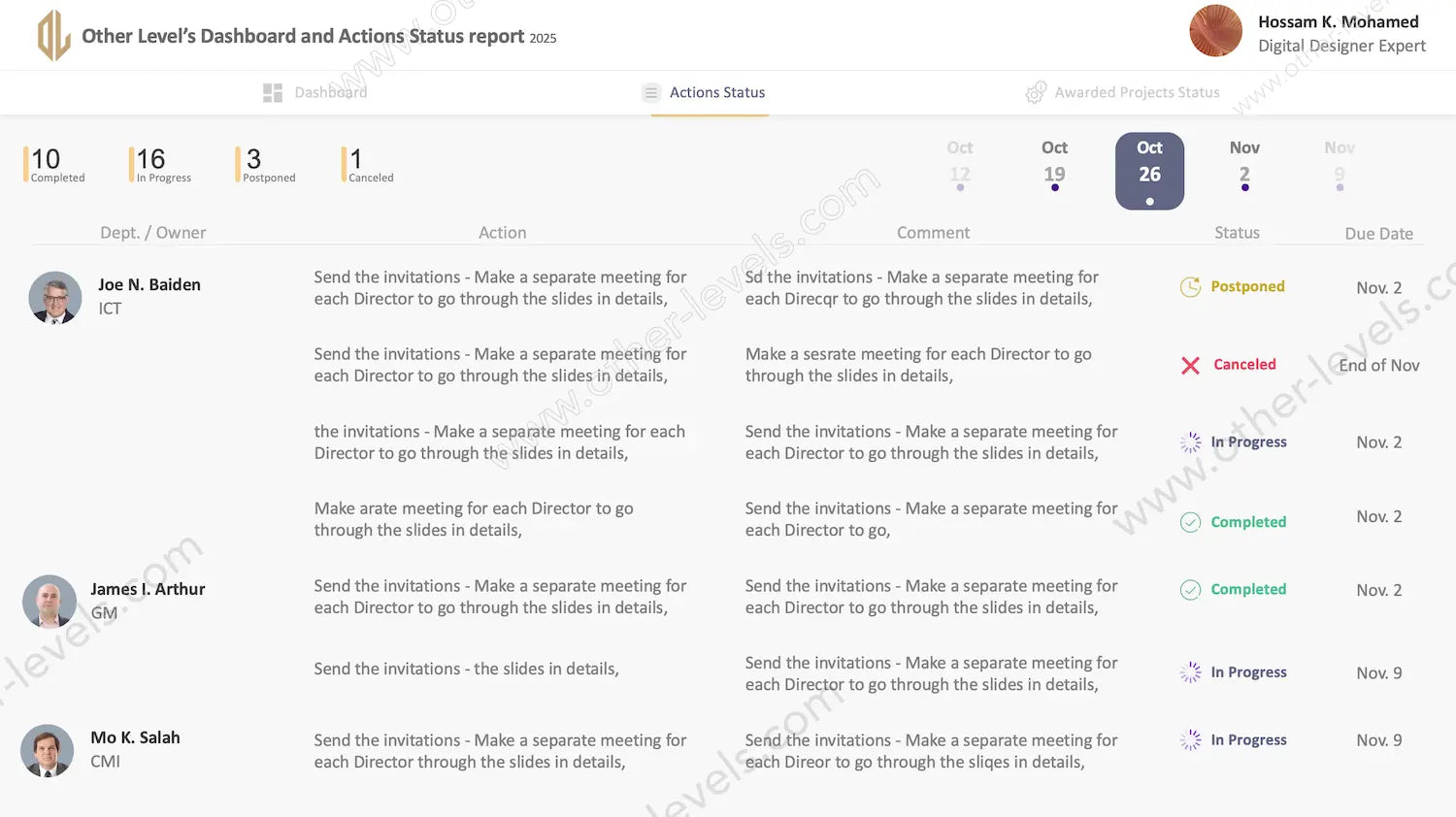
Action Status and Accountability Tracking
The PowerPoint Dashboard includes an operational page that organizes all department actions in a clean, table-based layout. Each task is assigned to a specific owner, showing real-time status indicators such as Completed, In Progress, or Postponed. With weekly date filters, executives can quickly review performance trends and identify areas needing follow-up or attention.
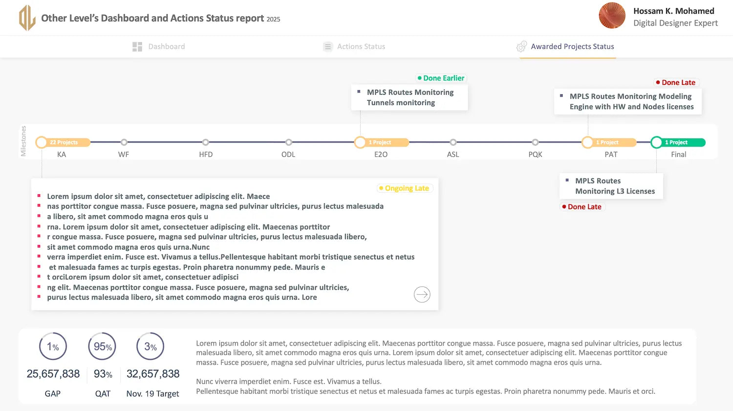
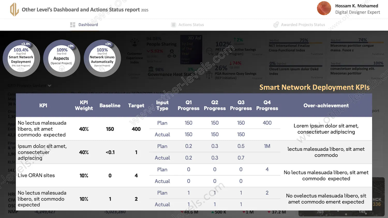
Project Timeline and Milestone Analysis
A dedicated timeline visually maps every project across stages—from initiation to completion. Each milestone is marked by color-coded status indicators: green for early completion, yellow for ongoing, and red for delays. Project cards summarize critical updates, while the bottom KPI section compares actual results to targets for clear visibility of organizational performance.
Key Features and Insights
- Modern layout tailored for management reviews and progress meetings
- Three sections: Dashboard, Actions Status, and Awarded Projects
- Interactive visual components built with Excel and optimized for PowerPoint display
- Instant visibility on KPI performance, project completion rate, and financial progress
- Ideal for presenting strategic updates, operational summaries, or quarterly reviews
Why This Dashboard Stands Out
It’s more than a report—it’s a communication tool. This PowerPoint Dashboard helps teams turn raw data into compelling visuals that guide action. With clean design, intuitive charts, and human-centered insights, it transforms complex information into a story of progress, accountability, and achievement.
For broader business tracking needs, explore our Project Management & Operations Bundle, which integrates multiple dashboards for complete organizational visibility. You can also enhance your analysis with the Project Performance Management Excel Dashboard — a specialized tool designed for deep performance analytics and KPI monitoring.
Watch the full tutorial on our Other Levels YouTube Channel
Specifications
Get all essential details in one place. From features and package contents to software compatibility and skill level required, this section gives you a clear overview so you know exactly what to expect before download.
Template Features
Package Details
Software Compatibility
Skill Level Required
Beginner
FAQs
Please read our FAQs page to find out more.
Are the templates fully customizable?
Yes, all our templates are fully customizable. You can adjust the layout, data, and design elements to fit your specific needs. Our templates are designed to be flexible, allowing you to easily tailor them to your preferences.
Can I order a product in any language?
Yes, we provide products in any language. Simply select the "Dashboard language change" Service and once your order is placed, you will receive it within 48 hours.
What happens if I choose the wrong monitor screen size for my dashboard?
If you choose the wrong screen size, the dashboard may not display correctly on your monitor. Elements could appear too large, too small, or misaligned, affecting the readability and usability of the dashboard. We recommend selecting the appropriate screen size to ensure optimal viewing and performance.
Do I need specific skills to use the advanced Excel dashboard templates?
Our advanced Excel dashboards are easy to use, the only thing you need to know is how to work with PivotTables. With basic knowledge of PivotTables, you'll be able to customize and fully utilize these templates effortlessly. "Please check the skill level required"
All dashboards are 100% editable Excel files. Learn how to use them through our video tutorials, included datasets, and lifetime access program.