✅ Instant Digital Delivery | 🔒 Secure Checkout | ⭐ Trusted by 1,000+ Professionals | 💬 24hr Support
Forecast Commit Excel Dashboard with Gross Profit Trajectory Insights
Pairs well with
Forecast Commit Dashboard – Performance Tracking for Weekly Reviews
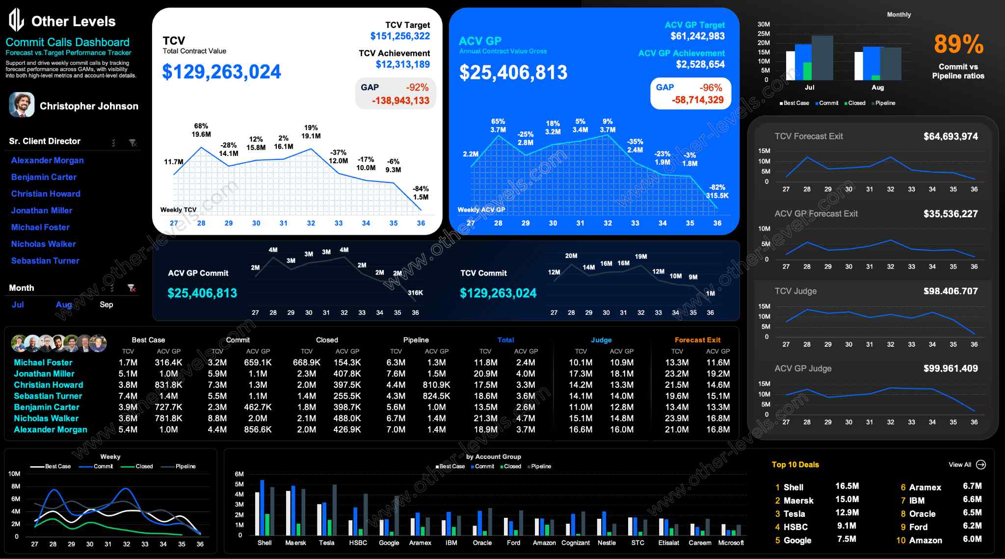
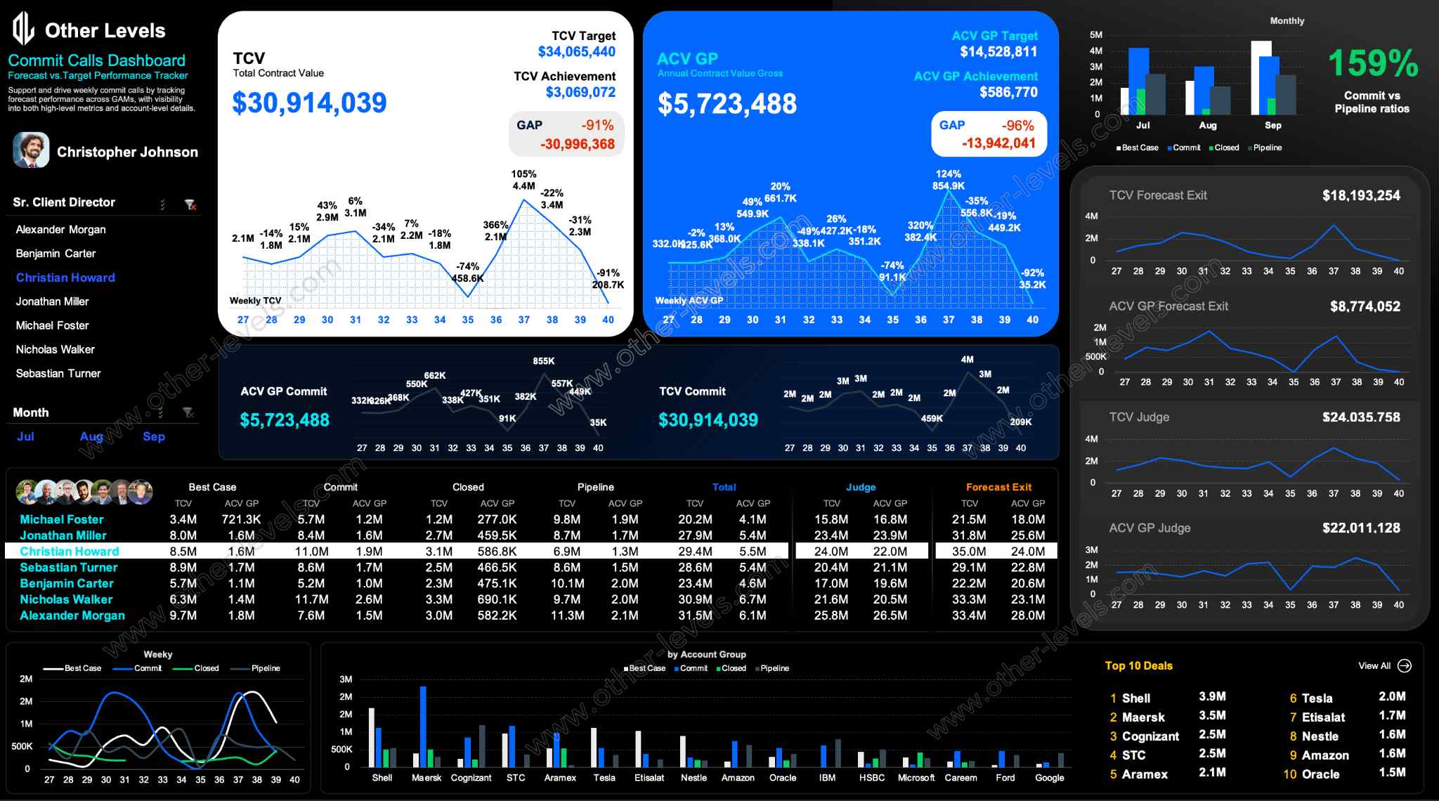
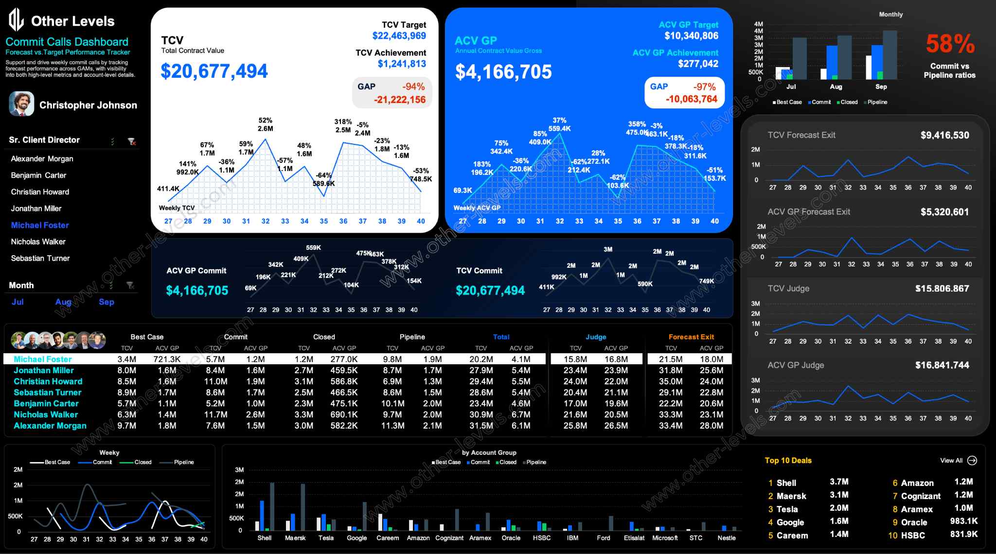
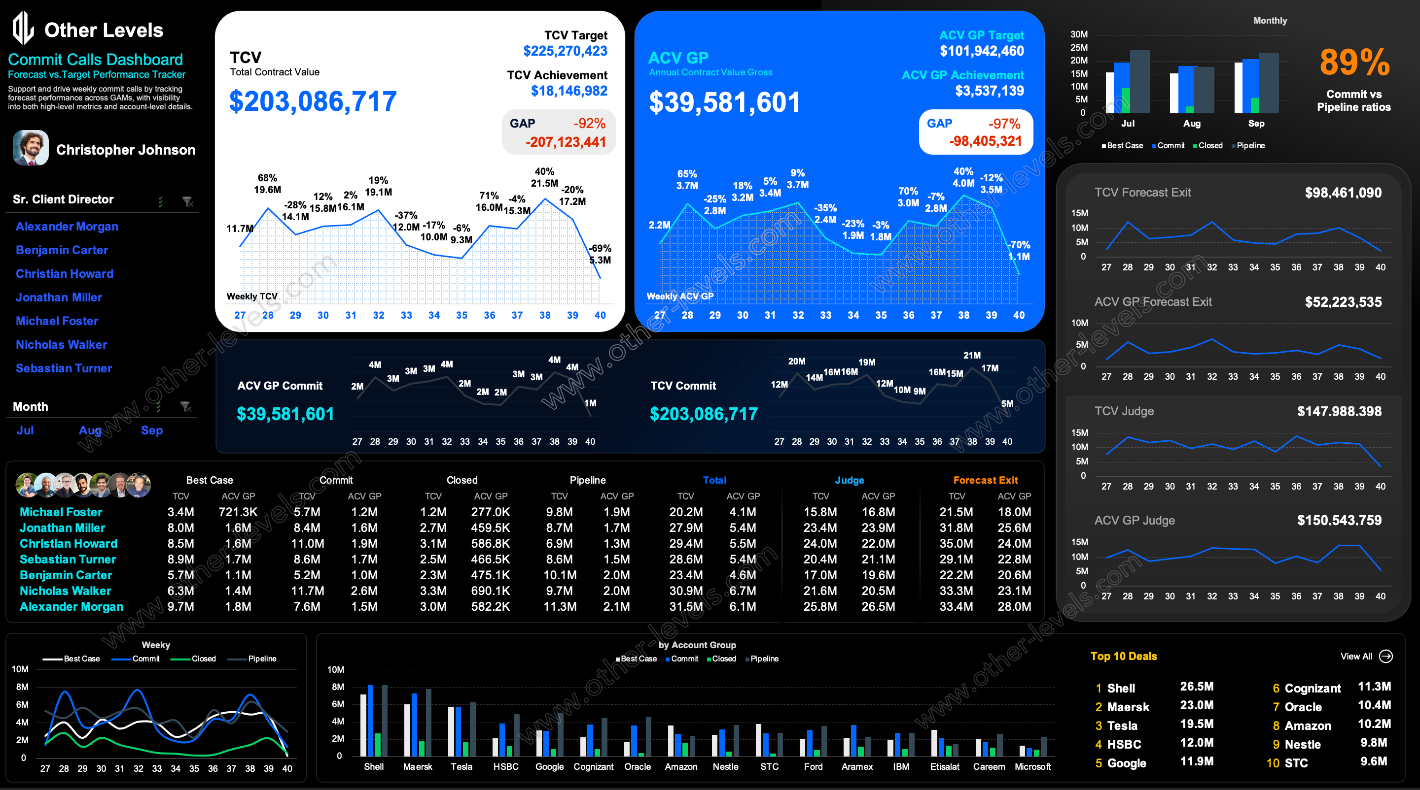
This Excel Dashboard is designed for teams who need a clear, structured view of forecast accuracy and commit discipline. It brings together weekly pacing, account-level insights, and month-end scenarios in one organized interface, helping leaders understand performance without digging through raw sheets. The goal is simple: give decision-makers a practical tool to monitor momentum and react early.
High-Level KPI Overview
The dashboard includes TCV and ACV views, providing a balanced picture of total contract value and gross profit expectations. These KPI cards highlight targets, achievement rates, and GAP values, allowing users to spot pacing risks before they escalate. The layout uses soft highlights and selective accent notes to draw attention to critical movements.
Weekly Trend Analysis
Two line charts track weekly changes, making it easy to read trajectory over time. Trend visuals help teams understand whether performance is improving, flattening, or slowing compared to the weekly plan, without complex interpretation. Managers can optionally extend the analysis by adding trendlines directly in Excel.
Forecast Exit & Judge Scenarios
Forecast Exit visuals estimate potential month-end landing positions based on recent pacing. These scenarios provide a fast read on risk or acceleration, supporting decision-making where commit stability and predictability matter most.
Manager & Account Performance
A structured comparison table displays best case, commit, closed, and pipeline values by manager, making ACV vs TCV performance easy to evaluate. Clustered visuals show momentum across key accounts so teams can immediately see which customers are driving results.
Pipeline Strength & Key Deals
Pipeline charts reveal conversion potential and coverage ratios, helping teams assess whether opportunity volume supports the forecast. A focused Top Deals view highlights the highest-impact opportunities, keeping attention on what matters most.
Why This Dashboard Matters
- Creates a clear weekly rhythm for tracking forecast and commit discipline.
- Turns complex forecasting logic into clean, executive-ready visuals.
- Surfaces early warning signals when momentum starts to slow.
- Supports accountability during weekly review and commit calls.
- Designed for presentations, reviews, and leadership discussions.
Video Walkthrough – Forecast Commit Excel Dashboard
Watch the full tutorial on our Other Levels YouTube Channel – Forecast Commit Excel Dashboard Walkthrough
Who Will Benefit
- Account managers running structured weekly forecast sessions.
- Leaders tracking ACV performance and gross profit pacing.
- Teams who prefer clean, dark-themed Excel dashboards.
- Analysts who need fast visibility into trajectory and pipeline health.
Specifications
Get all essential details in one place. From features and package contents to software compatibility and skill level required, this section gives you a clear overview so you know exactly what to expect before download.
Template Features
Package Details
Software Compatibility
Skill Level Required
Intermediate
FAQs
Please read our FAQs page to find out more.
Are the templates fully customizable?
Yes, all our templates are fully customizable. You can adjust the layout, data, and design elements to fit your specific needs. Our templates are designed to be flexible, allowing you to easily tailor them to your preferences.
Can I order a product in any language?
Yes, we provide products in any language. Simply select the "Dashboard language change" Service and once your order is placed, you will receive it within 48 hours.
What happens if I choose the wrong monitor screen size for my dashboard?
If you choose the wrong screen size, the dashboard may not display correctly on your monitor. Elements could appear too large, too small, or misaligned, affecting the readability and usability of the dashboard. We recommend selecting the appropriate screen size to ensure optimal viewing and performance.
Do I need specific skills to use the advanced Excel dashboard templates?
Our advanced Excel dashboards are easy to use, the only thing you need to know is how to work with PivotTables. With basic knowledge of PivotTables, you'll be able to customize and fully utilize these templates effortlessly. "Please check the skill level required"
All dashboards are 100% editable Excel files. Learn how to use them through our video tutorials, included datasets, and lifetime access program.