✅ Instant Digital Delivery | 🔒 Secure Checkout | ⭐ Trusted by 1,000+ Professionals | 💬 24hr Support
HR Metrics and Workforce Analysis Excel Dashboard – Advanced
Pairs well with
Overview of the HR Metrics and Workforce Analysis Excel Dashboard – Advanced
This Excel Dashboard is part of our professional HR Metrics Dashboard Templates, designed to help managers and HR teams monitor working hours in a year, employee contracts, and operating expenses. The dashboard is built in excel format for expense reports, making it easy to track financial performance, analyze spending categories, and compare paid vs unpaid invoices. It provides a powerful combination of HR, finance, and operations insights in one Productivity Dashboard.
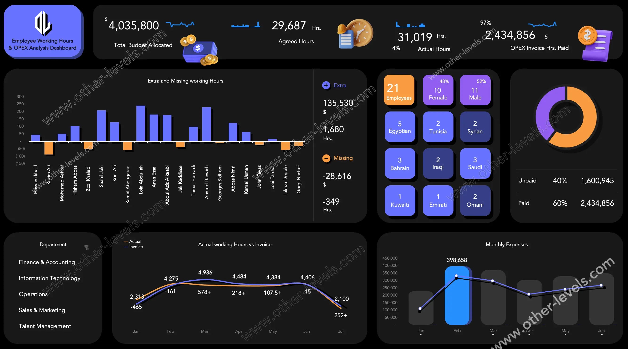
Key Dashboard KPIs
Total Budget and Operating Expenses
Track the total budget allocated to employees, monitor OPEX, and review all operating expenses linked to payment for the hours an employee has worked.
Agreed and Actual Hours
Compare employee work contract hours (planned) with actual working hours in a year. This helps ensure exempt employee work hours are in compliance with the employee work contract template.
KPI Dashboard View
Use this KPI Dashboard to track variances in time works plus employee data, helping managers analyze performance at a glance.
Employee Performance Analysis
Extra and Missing Hours
A bar chart highlights each employee’s work hours in a year, showing overtime and shortfalls. Positive values show additional effort, while negatives reveal exempt employee work hours missed.
Summary of Hours and Cost Analysis
The dashboard provides a consolidated cost analysis of extra vs missing hours. It shows the total financial impact of variations in payment for the hours an employee has worked.
Employee Demographic Data
Gain insights into your workforce by reviewing employee demographic data. The dashboard displays the number of employees, gender distribution, and nationality breakdown across your company.
Financial and Payment Tracking
Paid vs Unpaid Invoices
A donut chart shows the ratio of paid vs unpaid operating expenses, allowing managers to quickly identify pending obligations and manage cash flow effectively.
Department-Level Monitoring
Compare actual working hours against invoiced hours across all departments in a company, including Finance, IT, Sales, HR, and Operations. This view highlights discrepancies at a departmental level.
Trends and Visual Insights
Monthly Hours vs Invoices
A stacked bar chart combined with line data highlights differences between reported and billed hours month by month. This ensures accuracy in billing and prevents overcharging or underbilling.
Monthly Expenses
Visualize spending categories and operating expenses trends with a monthly chart. This makes it easier to manage a will template for expenses, track peaks, and identify irregular spending patterns.
Why Choose This Employee Dashboard?
This Employee Dashboard is an all-in-one tool that brings together HR, finance, and operational insights. By using this template, companies can monitor employee work contract compliance, analyze financial performance, track opex, and control costs with ease. As part of our advanced Excel Dashboard collection, it ensures you always have the right data at your fingertips to improve efficiency and make informed decisions.
Video Tutorial — Employee Working Hours and OPEX Analysis Dashboard
Specifications
Get all essential details in one place. From features and package contents to software compatibility and skill level required, this section gives you a clear overview so you know exactly what to expect before download.
Template Features
Package Details
Software Compatibility
Skill Level Required
Intermediate
FAQs
Please read our FAQs page to find out more.
Are the templates fully customizable?
Yes, all our templates are fully customizable. You can adjust the layout, data, and design elements to fit your specific needs. Our templates are designed to be flexible, allowing you to easily tailor them to your preferences.
Can I order a product in any language?
Yes, we provide products in any language. Simply select the "Dashboard language change" Service and once your order is placed, you will receive it within 48 hours.
What happens if I choose the wrong monitor screen size for my dashboard?
If you choose the wrong screen size, the dashboard may not display correctly on your monitor. Elements could appear too large, too small, or misaligned, affecting the readability and usability of the dashboard. We recommend selecting the appropriate screen size to ensure optimal viewing and performance.
Do I need specific skills to use the advanced Excel dashboard templates?
Our advanced Excel dashboards are easy to use, the only thing you need to know is how to work with PivotTables. With basic knowledge of PivotTables, you'll be able to customize and fully utilize these templates effortlessly. "Please check the skill level required"
All dashboards are 100% editable Excel files. Learn how to use them through our video tutorials, included datasets, and lifetime access program.